Education
Lanh nà
Year
2023
Industry
Management
Role
UI UX Designer
Challenge
In today's world, financial literacy is crucial for making informed decisions, yet many find the subject dull and challenging to grasp. The challenge was to transform financial education into an exciting and engaging experience that motivates users to learn and apply financial concepts in a practical way.
Overview
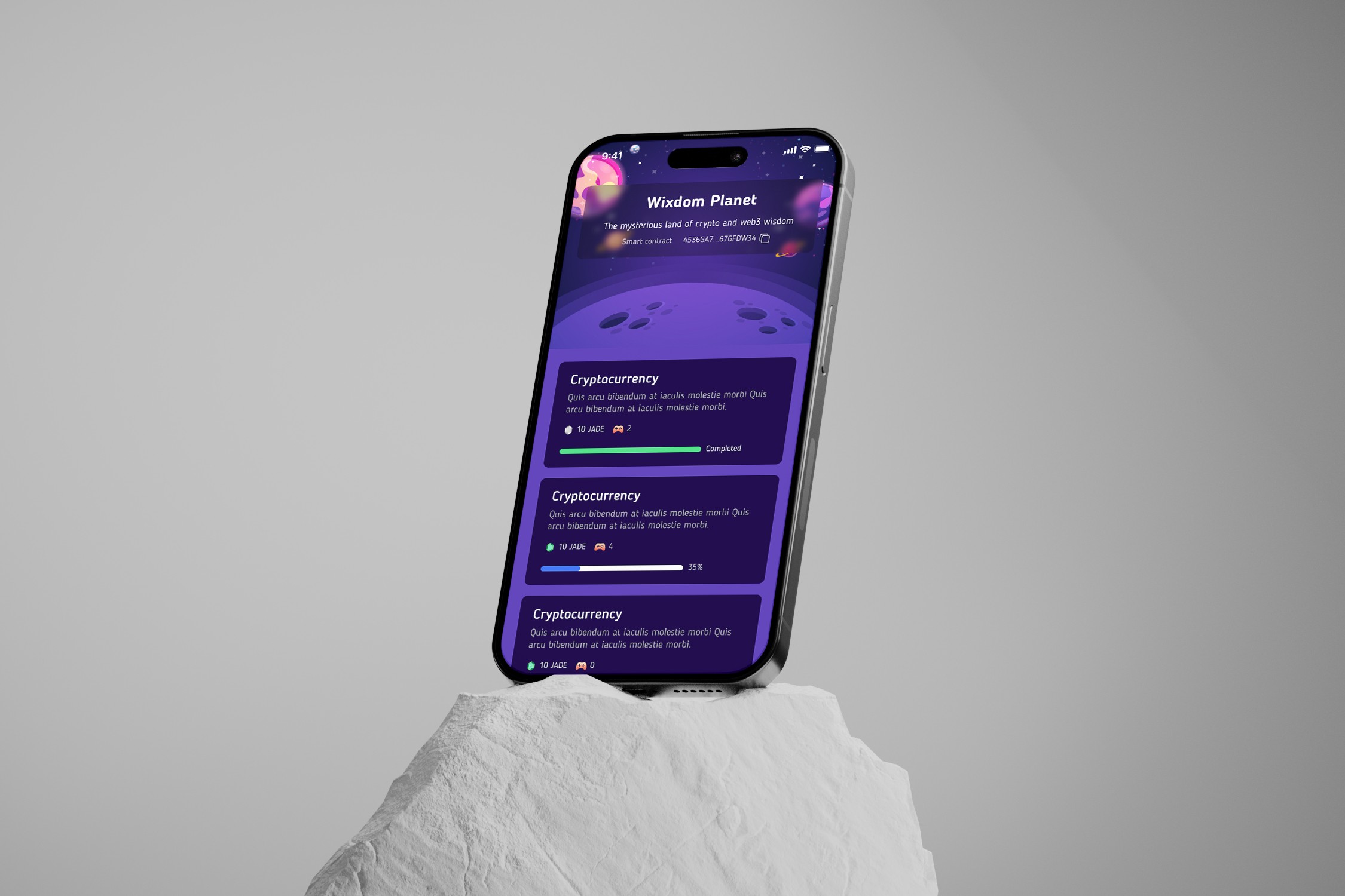
Wixdomplanet is an innovative project that leverages the power of gamification to teach financial concepts. The platform is designed for users of all ages, turning the complex world of finance into a series of enjoyable and interactive adventures. By integrating game mechanics into learning modules, Wixdomplanet aims to enhance user engagement and retention of financial knowledge.

Design Process
User story
As a user, I want to understand financial concepts through interactive games so that I can apply this knowledge in real-life scenarios without feeling overwhelmed.
User flow
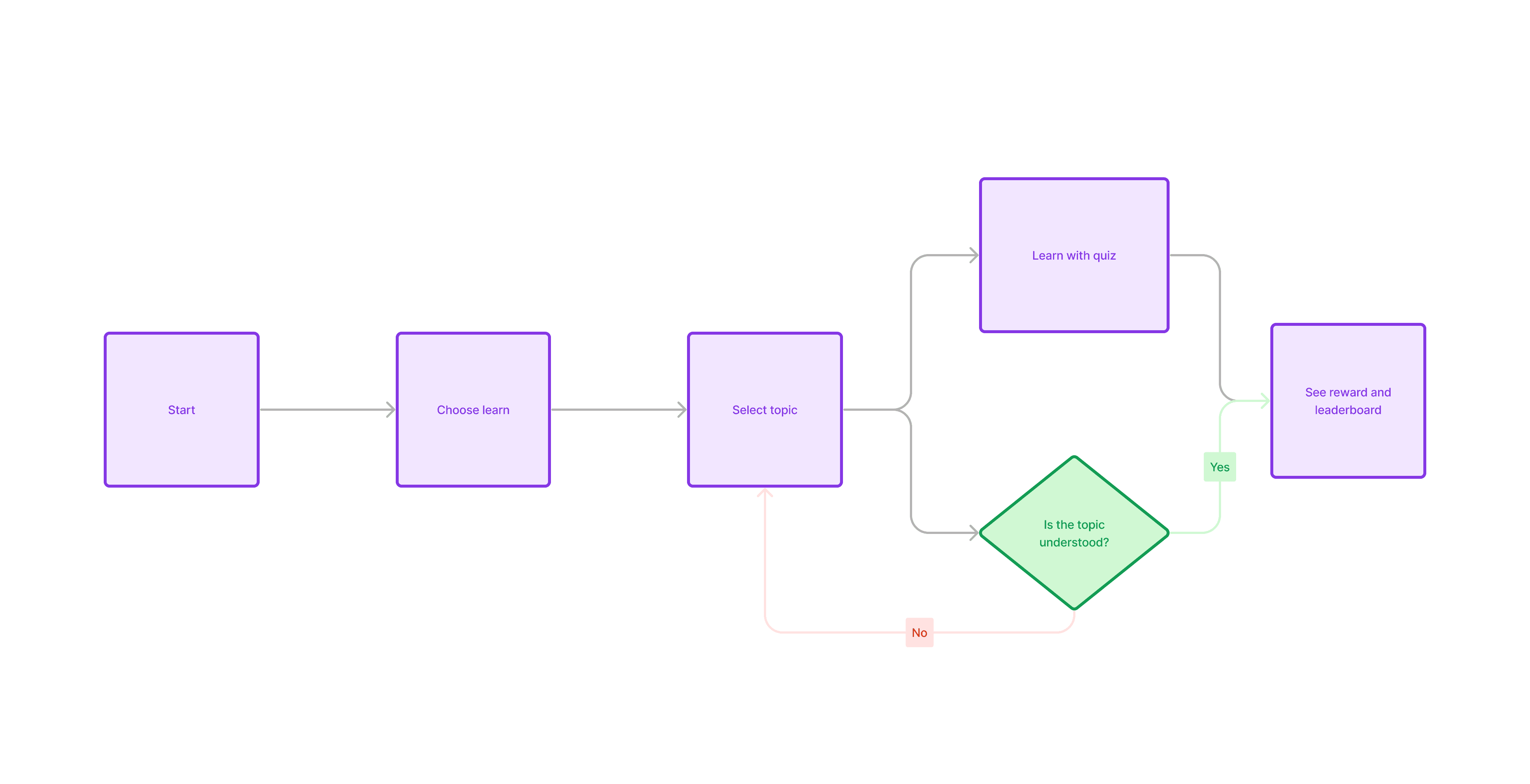
The user starts by creating an account and selecting a learning path based on their current knowledge level. Each learning path is structured as a series of levels, each introducing a new financial concept through interactive gameplay. Users earn points and badges as they progress, unlocking new levels and content.
Wireframe
Early wireframes focused on simplifying navigation and minimizing user inputs to enhance engagement. Key screens included a dashboard, game levels, tutorial sections, and a progress tracker. Each screen was designed to be intuitive, with clear calls to action and minimalistic design to keep the focus on learning content.

Design UI
The UI design incorporates bright colors and playful elements, reflecting the adventurous theme of the platform. Typography is friendly and accessible, with clear, concise text to aid comprehension. Interactive elements like buttons and icons are prominently featured, making the interface fun and easy to use.

To maintain consistency across the platform, a comprehensive design system was developed. This system includes guidelines for the use of color, typography, and UI elements, ensuring a cohesive look and feel throughout the user's learning journey.
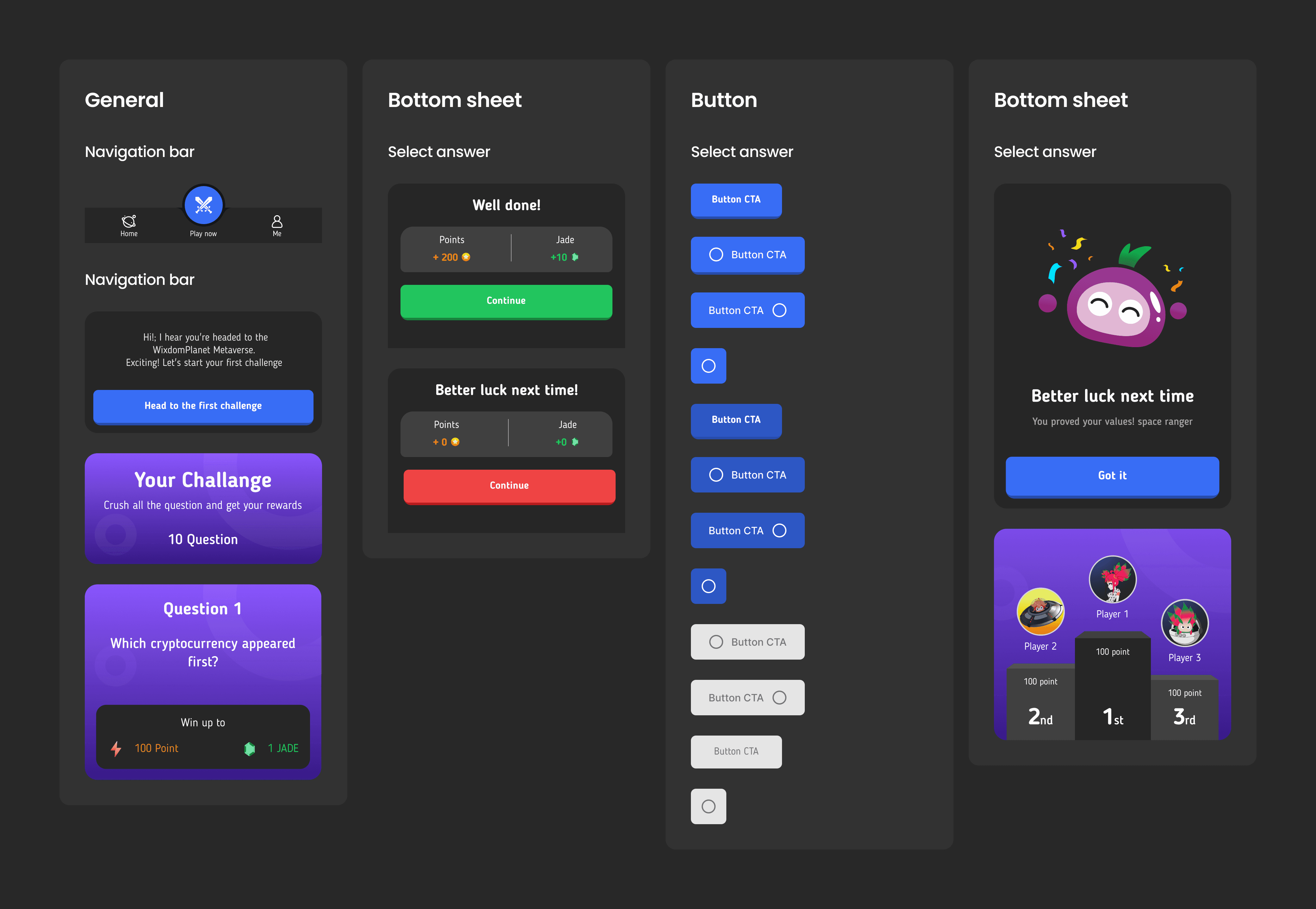
Additionally, a friendly mascot was introduced to guide users through the learning process. This character, which appears throughout the platform, helps in explaining complex financial concepts and adds a personal touch that enhances user engagement and retention.

Output


© 2024. Designed by Nguyen Van Lanh
© 2024. Designed by Nguyen Van Lanh
© 2024. Designed by Nguyen Van Lanh
Year
2023
Industry
Food & Drink
Role
UI UX Designer
Challenge
In today's world, financial literacy is crucial for making informed decisions, yet many find the subject dull and challenging to grasp. The challenge was to transform financial education into an exciting and engaging experience that motivates users to learn and apply financial concepts in a practical way.
Overview
Wixdomplanet is an innovative project that leverages the power of gamification to teach financial concepts. The platform is designed for users of all ages, turning the complex world of finance into a series of enjoyable and interactive adventures. By integrating game mechanics into learning modules, Wixdomplanet aims to enhance user engagement and retention of financial knowledge.

Design Process
User story
As a user, I want to understand financial concepts through interactive games so that I can apply this knowledge in real-life scenarios without feeling overwhelmed.
User flow
The user starts by creating an account and selecting a learning path based on their current knowledge level. Each learning path is structured as a series of levels, each introducing a new financial concept through interactive gameplay. Users earn points and badges as they progress, unlocking new levels and content.

Wireframe
Early wireframes focused on simplifying navigation and minimizing user inputs to enhance engagement. Key screens included a dashboard, game levels, tutorial sections, and a progress tracker. Each screen was designed to be intuitive, with clear calls to action and minimalistic design to keep the focus on learning content.

Design UI
The UI design incorporates bright colors and playful elements, reflecting the adventurous theme of the platform. Typography is friendly and accessible, with clear, concise text to aid comprehension. Interactive elements like buttons and icons are prominently featured, making the interface fun and easy to use.

To maintain consistency across the platform, a comprehensive design system was developed. This system includes guidelines for the use of color, typography, and UI elements, ensuring a cohesive look and feel throughout the user's learning journey.

Additionally, a friendly mascot was introduced to guide users through the learning process. This character, which appears throughout the platform, helps in explaining complex financial concepts and adds a personal touch that enhances user engagement and retention.

Output


Education
Lanh nà


Year
2023
Industry
Food & Drink
Role
UI UX Designer
Challenge
In today's world, financial literacy is crucial for making informed decisions, yet many find the subject dull and challenging to grasp. The challenge was to transform financial education into an exciting and engaging experience that motivates users to learn and apply financial concepts in a practical way.
Education
Lanh nà


Overview
Wixdomplanet is an innovative project that leverages the power of gamification to teach financial concepts. The platform is designed for users of all ages, turning the complex world of finance into a series of enjoyable and interactive adventures. By integrating game mechanics into learning modules, Wixdomplanet aims to enhance user engagement and retention of financial knowledge.

Design Process
User story
As a user, I want to understand financial concepts through interactive games so that I can apply this knowledge in real-life scenarios without feeling overwhelmed.
User flow
The user starts by creating an account and selecting a learning path based on their current knowledge level. Each learning path is structured as a series of levels, each introducing a new financial concept through interactive gameplay. Users earn points and badges as they progress, unlocking new levels and content.

Wireframe
Early wireframes focused on simplifying navigation and minimizing user inputs to enhance engagement. Key screens included a dashboard, game levels, tutorial sections, and a progress tracker. Each screen was designed to be intuitive, with clear calls to action and minimalistic design to keep the focus on learning content.

Design UI
The UI design incorporates bright colors and playful elements, reflecting the adventurous theme of the platform. Typography is friendly and accessible, with clear, concise text to aid comprehension. Interactive elements like buttons and icons are prominently featured, making the interface fun and easy to use.

To maintain consistency across the platform, a comprehensive design system was developed. This system includes guidelines for the use of color, typography, and UI elements, ensuring a cohesive look and feel throughout the user's learning journey.

Additionally, a friendly mascot was introduced to guide users through the learning process. This character, which appears throughout the platform, helps in explaining complex financial concepts and adds a personal touch that enhances user engagement and retention.

Output


